The Gorpcore Color Formula: Earth Tones Plus One Neon
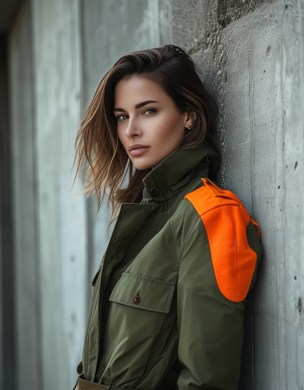
Quick Answer: Build the outfit from two or three earth tones - olive, stone, brown, charcoal, black - and add exactly one high-visibility accent: safety orange, acid green, or cobalt, in the smallest visible dose. A carabiner, laces, a beanie, one strap. One neon reads as intentional trail DNA; two reads as a gear-closet explosion. The formula works because real hiking equipment is designed exactly this way - muted shells with visibility accents - so following it borrows authenticity automatically.
Gorpcore keeps defeating people at the same fence: the individual pieces are great, and the assembled outfit somehow looks like a sponsorship deal gone wrong. The difference between the two outcomes is almost never the gear. It is the color math.


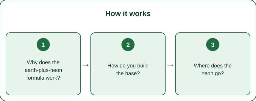
Why does the earth-plus-neon formula work?
Because it is stolen directly from how real equipment is designed, and authenticity is the entire currency of this aesthetic.
Trail gear ships in this palette on purpose. Technical brands build shells and packs in muted, terrain-adjacent colors and then add high-visibility hits - zipper pulls, logo tabs, cordage - so the gear reads on a mountainside and in a crowd. When your outfit repeats that ratio, it inherits the design logic of the real thing. When it inverts the ratio - neon body, muted accents - it reads as fashion cosplaying function, which is the exact failure gorpcore cannot survive.
Small doses of saturation carry disproportionate weight. A safety-orange carabiner against an olive jacket draws the eye harder than an entire orange jacket does, because contrast concentrated in a small area registers as a decision. Color theory calls it accent economy; stylists call it the pop; hikers call it Tuesday.
The muted base does the quiet work. Earth tones sit close together in value, so olive, stone, and brown layer without argument - which is what makes the volume-heavy silhouettes of gorpcore (big shell, wide pant, chunky shoe) coherent instead of chaotic. The palette absorbs the bulk.
And the formula is thrift-proof. Because the base is common colors in common fabrics, army-surplus finds, secondhand fleeces, and decade-old shells slot straight in. The one-neon accent - the cheapest part - is what makes the whole thing look current. An expensive way to look outdoorsy exists, but the formula specifically does not require it.
How do you build the base?
Three decisions, made once, cover every outfit after.
Pick two or three earth tones and stop. The working families: olive-to-sage greens, stone-to-sand beiges, chocolate-to-tan browns, charcoal-to-black. Any two families plus black works; three families is the ceiling. The most reliable starter trio is olive, stone, and black - nearly every technical piece ever made comes in one of them.
Vary texture inside the palette. The depth that makes a muted outfit interesting comes from surface, not color: crinkled ripstop against high-pile fleece, matte canvas against a slick shell, ribbed knit under quilted nylon. Two olive pieces in two textures read as styled; two olive pieces in the same nylon read as a uniform.
One volume piece per outfit. Gorpcore’s silhouettes run big, and the formula holds only if a single item carries the bulk - the oversized shell over slim bottoms, or the wide cargo pant under a fitted fleece. For the fitted layer, this is where leggings quietly do their best work: buttery-soft leggings in black or deep brown under an oversized shell is the most wearable everyday version of the look, the technical jacket doing the talking while the bottom half stays clean.
Footwear stays in-palette and load-bearing. Trail runners, approach shoes, or hiking sandals in muted colorways - ideally with the neon arriving in the laces, which is the single easiest accent placement in the entire aesthetic.
The base test before the accent goes on: photographed in grayscale, the outfit should still look composed - close values, one volume, varied texture. If it works in gray, it is ready for its one drop of color.
Where does the neon go?
In the smallest visible unit, and in exactly one place.
The accent hierarchy, from safest to boldest: laces, then a carabiner or zipper pull, then a beanie or cap, then socks flashing above the shoe, then a water bottle or chalk-bag-style pouch, then one strap of the pack or bag, and finally - expert level - a base layer glimpsed at the collar or hem. Each step up increases the visible area, and the confidence required.
The orange family is the native tongue. Safety orange is the color of trail markers, hunting season, and rescue gear - it carries the most outdoor authenticity per square inch. Acid green and lime read slightly more fashion; cobalt and royal blue read retro-alpine, straight off a 1990s shell. All are correct; orange is the default.
One accent means one. The orange beanie and the green laces do not compromise with each other - they compete, and the outfit loses. Before leaving, run the audit: count the saturated items a stranger would notice. The answer must be one. This single check prevents the gear-closet effect more reliably than any purchase.
Let functional items be the accent whenever possible. A real carabiner clipping keys, actual trail gaiters, a genuine Nalgene - the aesthetic rewards objects that do a job, and the accent slot is the cheapest place to be authentic. A five-dollar carabiner outperforms a fifty-dollar decorative version of the same idea.
And in low light, the accent moonlights as safety. The visibility hit that styles the outfit also makes evening dog walks and dusk runs to the store genuinely safer - the rare styling rule with a public-health argument.
Myth vs Fact: Gorpcore
Myth: It requires expensive alpine brands. Fact: The palette does the work, not the logo. Army surplus, thrifted fleece, decade-old rain shells, and hardware-store carabiners assemble into the look for the price of lunch - arguably more authentically, since visible wear is a feature in this aesthetic, not a flaw. One real technical piece anchors an outfit; five is a spending habit.
Myth: Every piece should be technical. Fact: All-technical outfits read as a trailhead, not a street. The look breathes when one or two technical pieces sit against ordinary fabrics - a shell over a cotton hoodie, cargo pants with a plain knit. The friction between function and normalcy is the style.
Myth: More neon equals more gorpcore. Fact: Head-to-toe high-vis is costume territory - the outfit equivalent of shouting. Real gear is mostly muted with visibility accents, and outfits that copy that ratio look right for reasons observers cannot name. One accent, smallest visible unit, non-negotiable.
Myth: The look dies in summer heat. Fact: Late summer is prime season for the lightweight tier: hiking shorts or high-waisted leggings with a technical tank, a packable windbreaker for over-air-conditioned interiors and cooling evenings, trail sandals, and the accent carabiner. The heavy fleece is one act of a year-round wardrobe, not the whole play.
Myth: Women’s gorpcore just means wearing men’s gear. Fact: The proportions are the women’s-styling advantage: cinched waists on oversized shells, cropped fleeces over fitted bases, volume balanced against structure. Borrowed-from-the-boys is one flavor - tailored-to-the-frame photographs better and walks further.
FAQ: Gorpcore Color Questions, Answered
What colors count as gorpcore?
The base is terrain colors: olive and sage, stone and sand, brown and tan, charcoal and black. The accents are equipment colors: safety orange, acid or lime green, cobalt blue. Build entire outfits from the first list and add exactly one small item from the second - that ratio is the whole aesthetic.
Can I wear gorpcore in summer?
Comfortably - shift to the lightweight tier: technical shorts or leggings, a breathable tank, a packable windbreaker, trail runners or hiking sandals, and the accent in laces or a carabiner. The palette and the one-neon rule stay identical; only the fabric weight changes with the thermometer.
Do I need real hiking gear for the look to work?
One genuine technical piece - a real shell, actual trail runners, a functional carabiner - anchors the outfit and lets everything else be ordinary or thrifted. All-replica outfits miss the point in both directions: no function underneath, and full price on top.
What shoes work with gorpcore outfits?
Trail runners are the default, approach shoes the sturdier option, hiking sandals the summer play, and chunky retro hikers the fashion-forward end. Keep the shoe body in-palette - muted earth tones - and let laces carry the neon. Clean white gym sneakers are the one shoe that breaks the spell.
TL;DR:
- Two or three earth tones per outfit - olive, stone, brown, charcoal - plus exactly one neon accent.
- Put the neon in the smallest visible unit: laces, carabiner, beanie, one strap. One means one.
- Vary texture within the muted base; allow one volume piece; keep shoes in-palette.
- Orange is the most authentic accent - it is literally the color of trail safety.
- Thrift the base, spend nothing on the accent, and let a single real technical piece anchor it.
The gear was never the problem. The outfit that looks like a gear closet is a counting error - and the correct count is one.
See It in Motion
Seen here: High Waist 8” Yoga Shorts — shop similar styles on bubblelime.com
Keep Reading
This article is for general informational and styling purposes only. Fit, sizing, and product availability may vary.